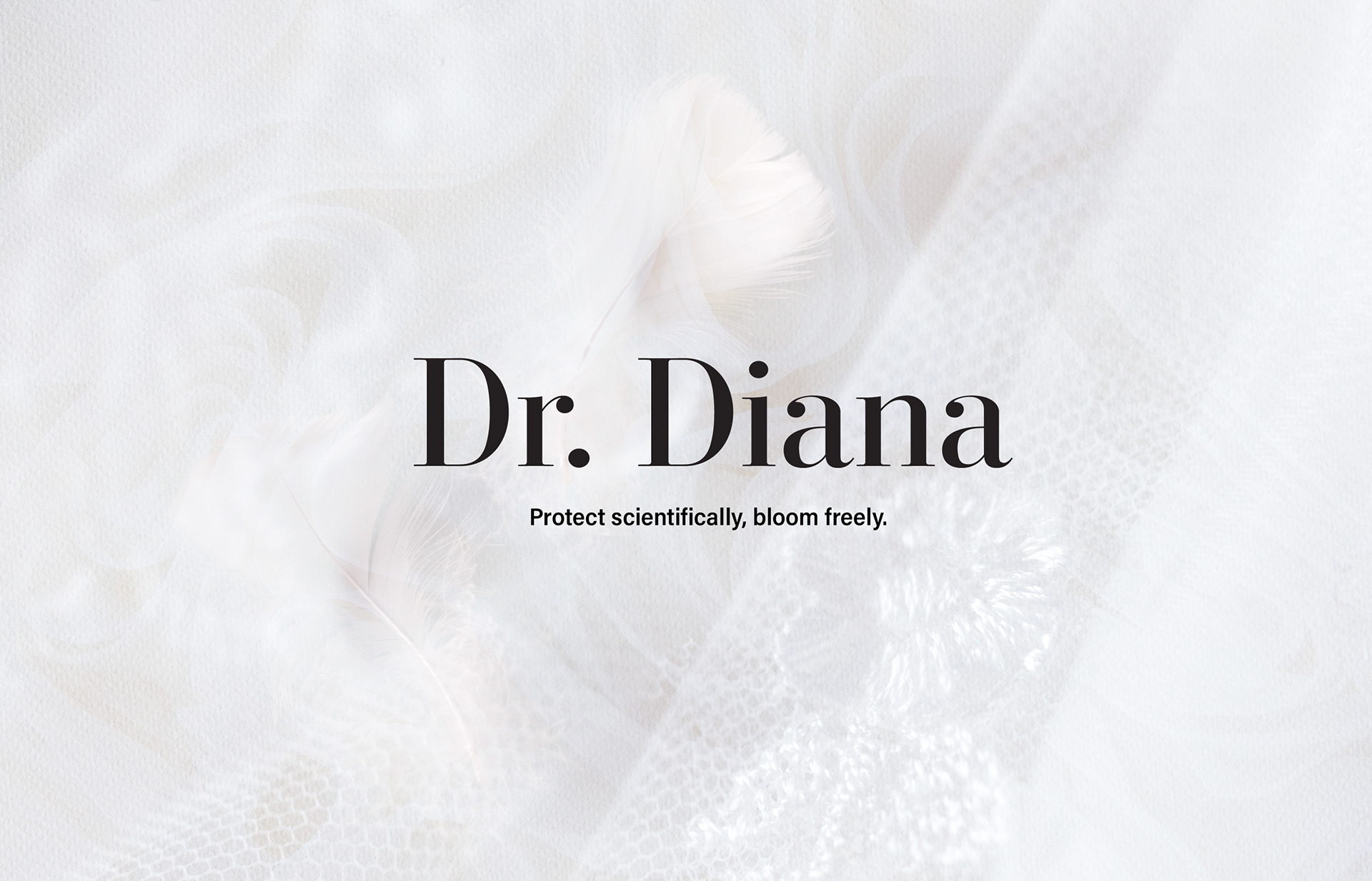
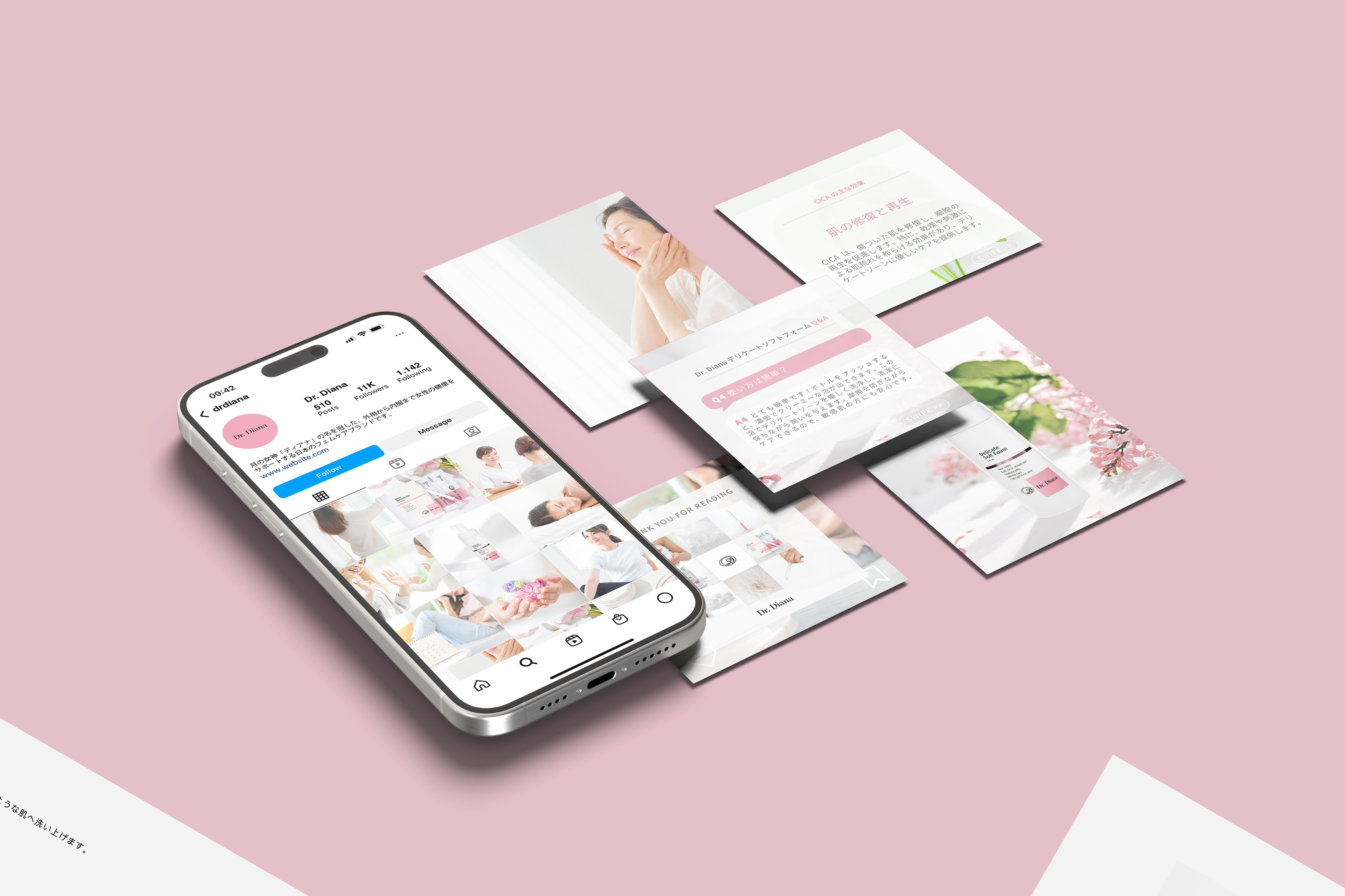
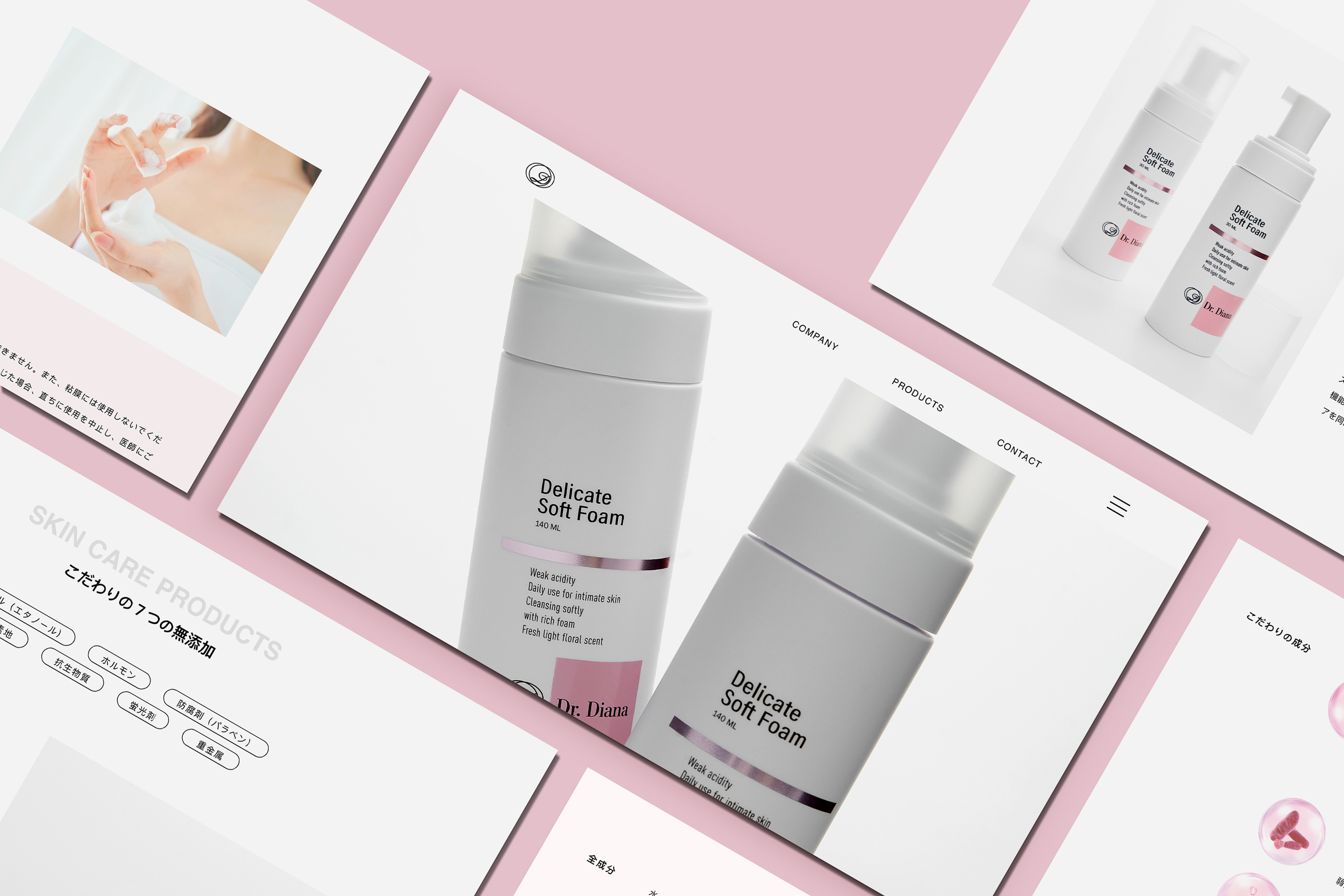
Project: Branding for Dr. Diana, 2024
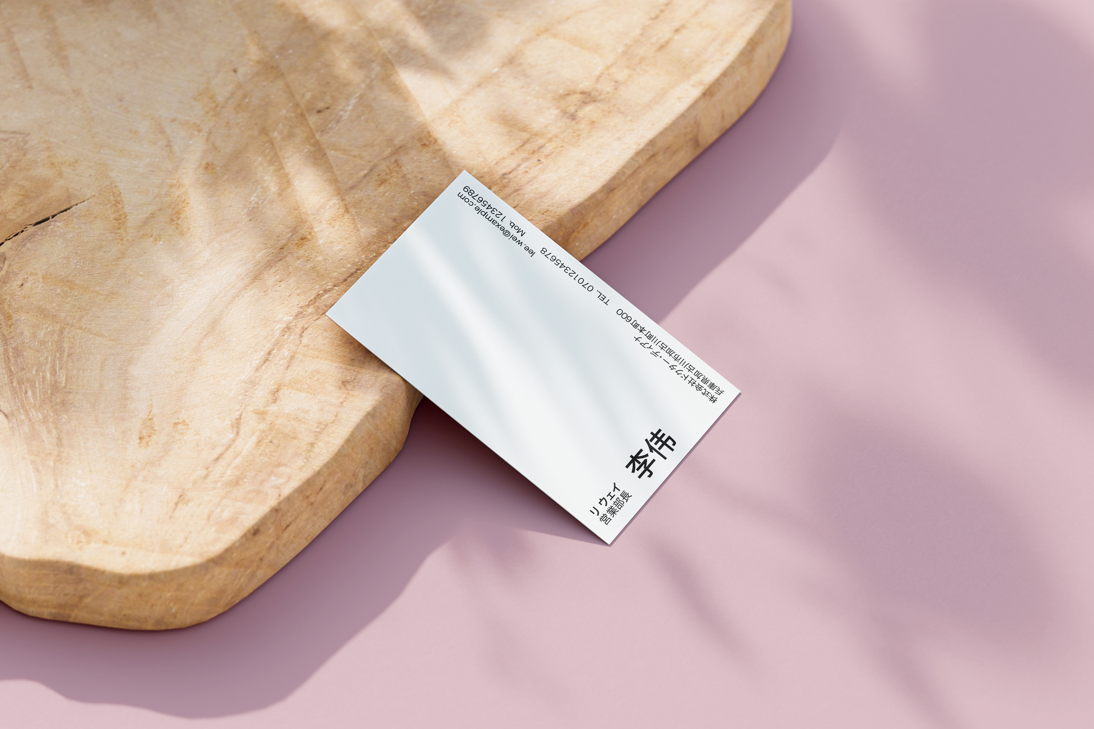
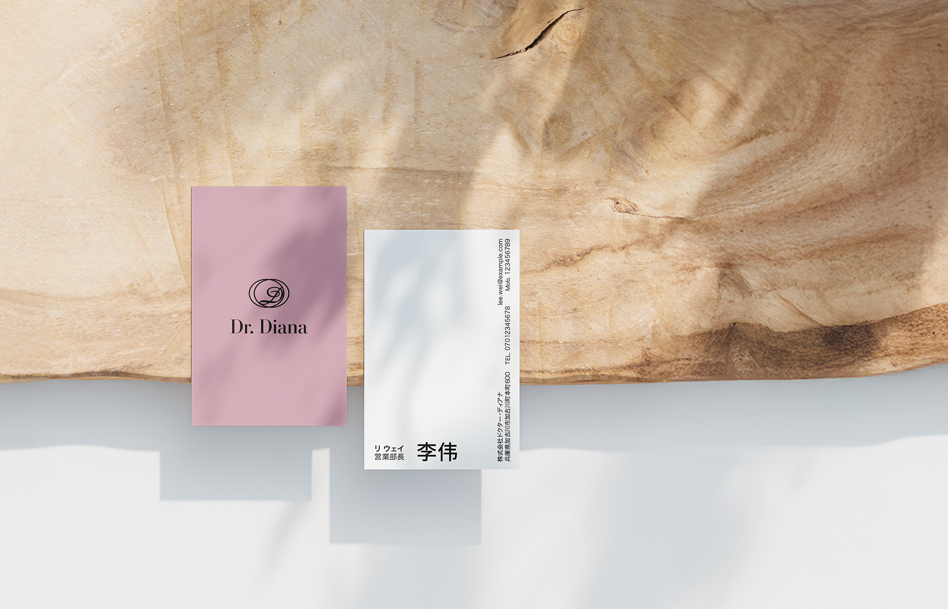
Scope: Designed logo suite, business cards, Instagram posts, products, and product website
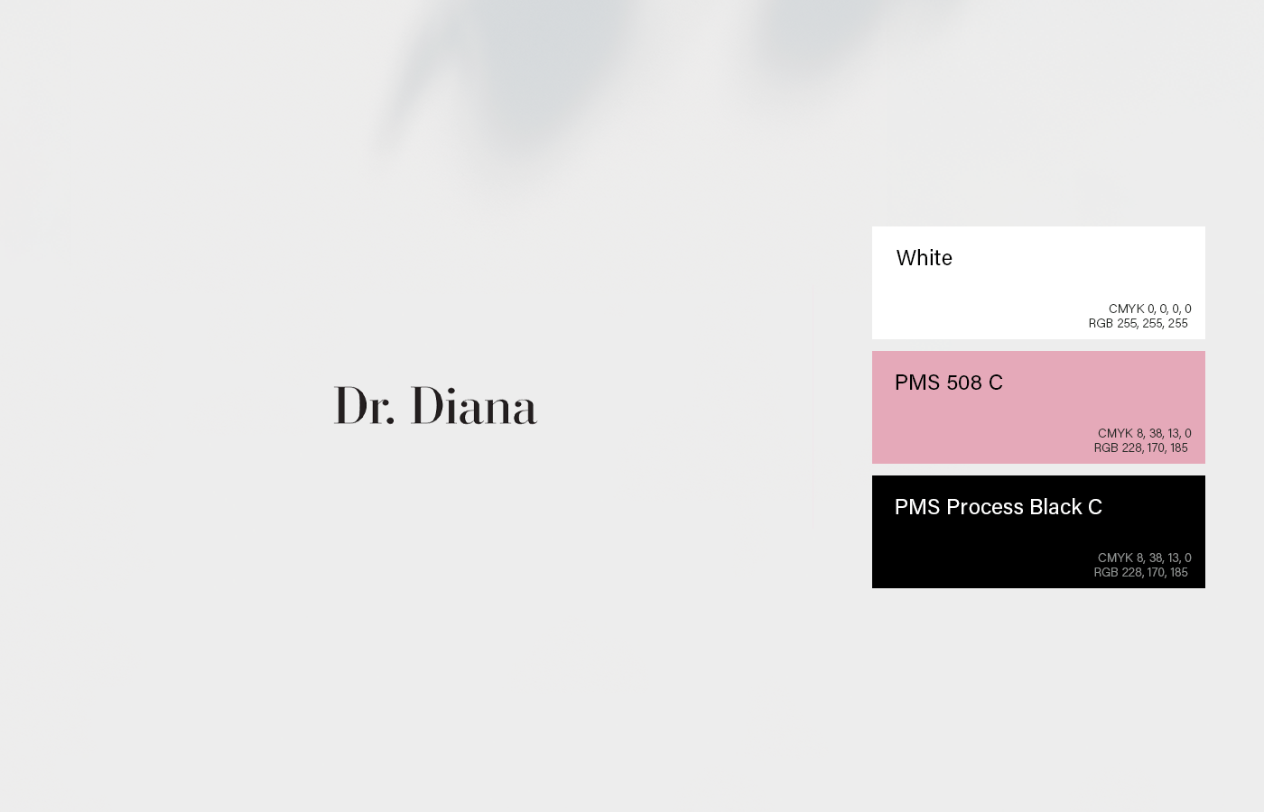
Dr. Diana envisioned a brand that was professional, minimal, and laboratory-inspired, reflecting the aesthetic of Japanese Dr. Cosme products. White served as the primary color, reinforcing a clean and clinical look, while subtle touches of light pink added a soft, feminine tone in line with the brand’s focus on feminine care. At the same time, the design needed to capture the themes of freedom, independence, and creativity embodied by the name Diana, the goddess of the moon.